Product Detail Page Redesign
Reworking the highest-intent page in the store into a faster, clearer path from interest to add-to-cart.
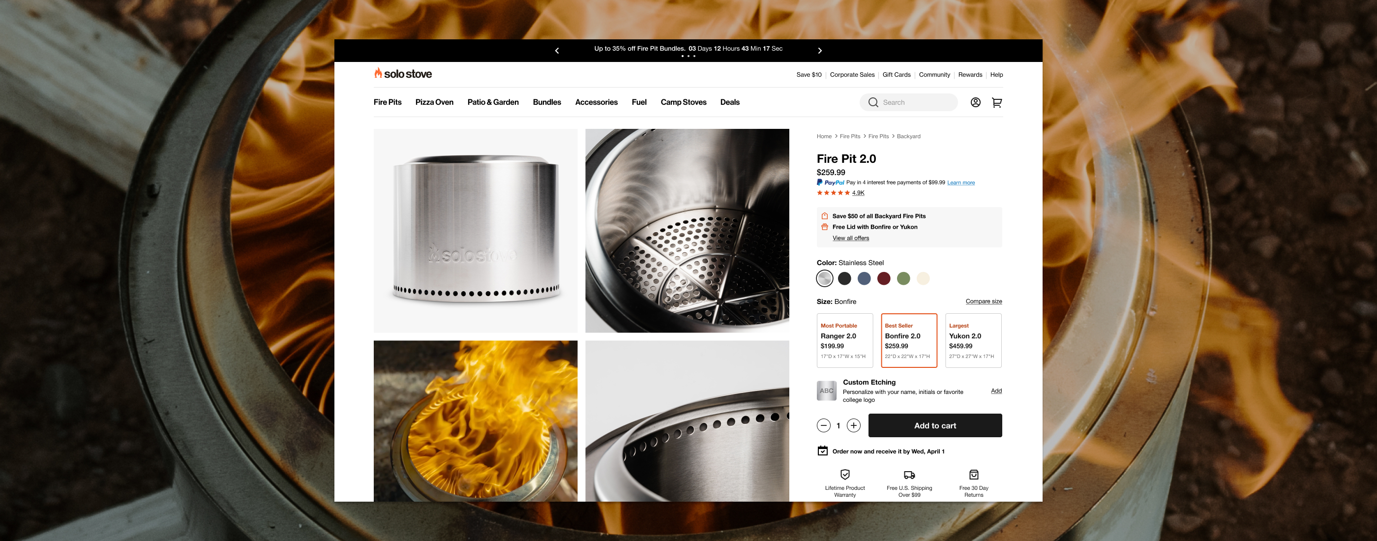
The product detail page carried the most purchase intent in the funnel — and the most room to improve.
Set up the context: where the PDP sat in the journey, what shoppers were trying to do, and why the existing page made deciding harder than it needed to be.
Add a few sentences of narrative so this column scrolls past the sticky details on the left — the editorial intro that frames the rest of the case study before the standard sections take over.
Name the opportunity plainly: a clearer, faster PDP was the most direct lever on conversion, and the reason this work got prioritized.
Keep it focused: the problem, the stakes, and the shape of the work ahead. Placeholder copy — replace with the real story.
The Challenge
Placeholder challenge — the core tension the redesign had to resolve.
Describe the obstacles: a crowded layout, weak media, an unclear buy box, or hierarchy that buried the details shoppers needed to decide.
Approach
A short, bold statement of the strategy — the single idea that shaped the redesign.
02 The work
The Solution
Placeholder solution summary — what shipped and how it addressed the challenge.
Walk through the key decisions: a focused media gallery, a clearer hierarchy, and a buy box that kept the next step always in reach.
Impact