Solo Brands
End-to-end experience design and experimentation across a multi-brand DTC portfolio, redesigning every surface of Solo Stove's purchase funnel and testing every strong opinion along the way.
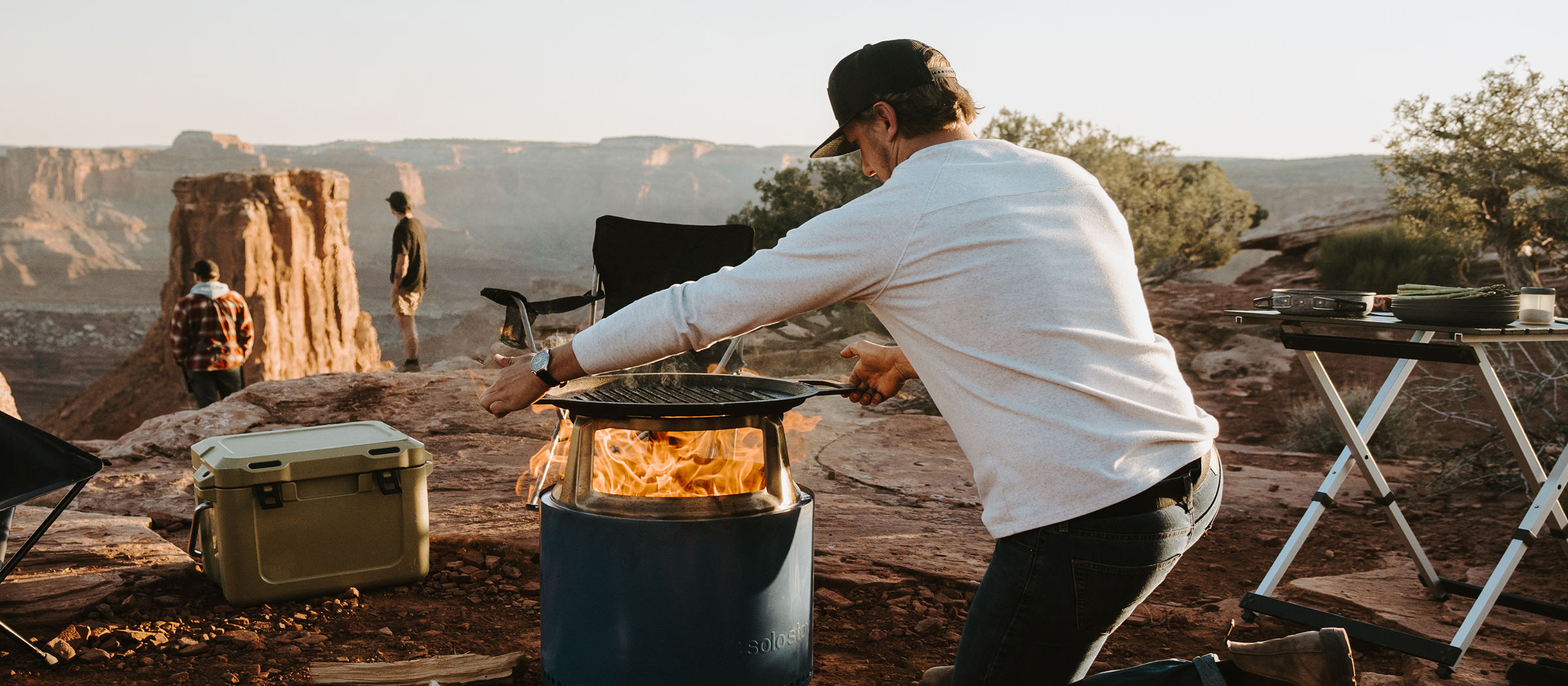
Every purchase at Solo Stove passed through the product page, the cart, the listing page, and the navigation. I redesigned all four.
Solo Brands is the DTC portfolio behind Solo Stove, Chubbies, Oru Kayak, and ISLE. I led product design across the portfolio and owned the A/B testing program alongside it, which meant the same person forming the design opinions was accountable for proving them.
The deepest work was at Solo Stove, where the funnel had grown by accretion. Product pages sold in isolation, the cart hadn't earned its traffic, the listing page manufactured hard decisions, and the navigation no longer matched what people came to buy. Rather than one big reveal, the funnel was rebuilt surface by surface.
The method stayed constant. FullStory session recordings and user testing found the friction, redesigns shipped as hypotheses through the experimentation program, and conversion, order value, and retention had the last word.
Approach
Every strong opinion is a hypothesis. The funnel earned its redesign one test at a time.
Product Page
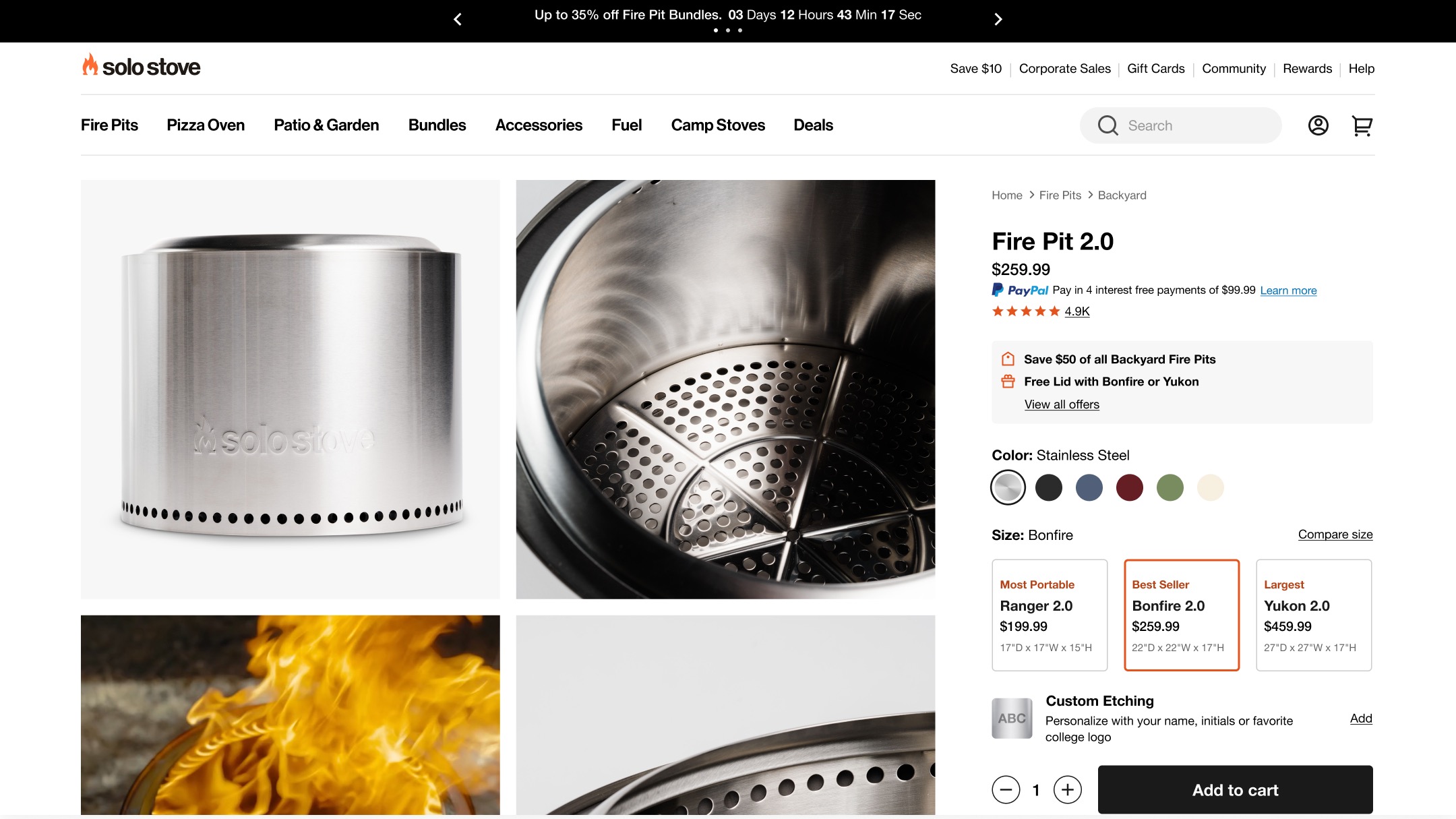
The page where browsing becomes buying sold every product in isolation, and made customers do the comparison work themselves.
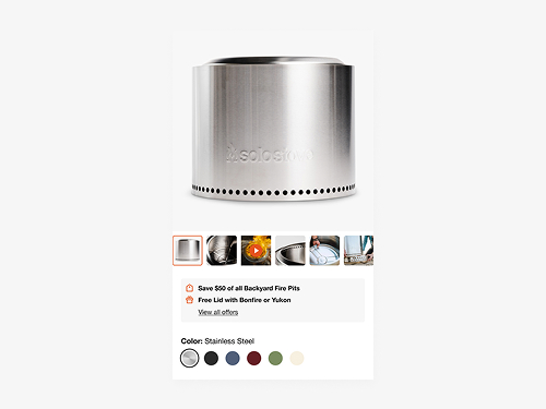
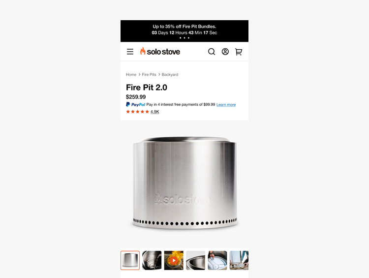
The PDP carries the whole catalog of fire pits, pizza ovens, furniture, and gear, with a growing set of colorways. FullStory showed the friction in miniature. Shoppers changed swatches, then scrolled back and forth to watch the imagery update, a small annoyance repeated thousands of times. Bundles and accessories, the clearest lever on order value, sat too far from the buying decision.
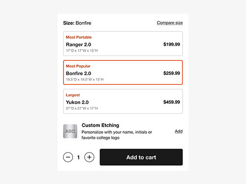
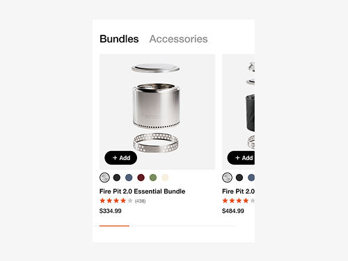
The redesign rebuilt the page wholesale. A premium, imagery-led layout rolled out to every product line, fire pits presented as variants side by side on one page, swatches moved next to the imagery, and bundles pulled up beside the buy. The biggest wins came from moving old sections closer together rather than adding new ones, and the variant module outperformed the separate pages it replaced.
Cart
Every purchase passed through the cart, and it hadn't earned that traffic.
The legacy cart was a relic. Functionality was limited, the layout no longer reflected the brand, and session recordings showed customers hunting for the promo code field during releases built around promo codes. Shipping progress and accepted payment methods, trust signals shoppers treat as standard, weren't shown at all.
The overhaul had to seat considerable new functionality in one hierarchy. Express checkout, free gift unlocks, rewards sign-in, custom etching, protection plans, shipping progress, promo entry, and payment methods all needed a place. Every addition had a case for being first, so the real design work was deciding what earned each position. User testing and competitor research settled arguments that opinions couldn't, and the additions gave the cart order-value levers it never had, placed at the moment shoppers commit.
Listing Page
Twelve cards for what was really three or four fire pits. Shoppers clicked images that went nowhere and scrolled options that weren't options.
The listing page is where shoppers form their consideration set, and the old page fought them. Every size variant got its own card, so a handful of products presented as a dozen. Product images weren't clickable, producing dead clicks where session recordings showed shoppers expecting a path forward. There was no add to cart, no route into customization, and no filtering.
The rebuild collapsed the grid around the real decision. One card per product with sizes and colors selectable in place, direct actions to cart and customization, filtering on the left rail, and badges and promo messaging that surface value without adding noise. The counterintuitive move was shrinking the grid, since fewer cards read as a clearer choice rather than a smaller catalog.
Navigation
The part of the store almost every visit passed through, and one of the least examined.
Solo Stove's navigation had grown by accretion. An audit showed categories in an order that no longer matched what people came to buy or the revenue they represented, with accessibility gaps that shut some shoppers out entirely. Framing the reordering in the revenue numbers leadership already trusted turned a design opinion into an easy yes.
The timing was the constraint. A full headless replatform had just kicked off, so the work shipped in phases inside that effort rather than competing with it. The first phase took the lowest-risk, highest-trust changes, covering accessibility fixes, hierarchy, and the usability problems the audit surfaced, and returned results before the visual refresh ever shipped.
Measured after the first structural phase, before the visual refresh shipped.
CRO Program
Owning design and the A/B program together closed the loop between opinion and evidence.
Each redesign entered the backlog as a hypothesis with a metric attached, shipped as a test, and lived or died on the readout. FullStory and user testing supplied the leads, from dead clicks to swatch round-trips to promo hunting, and the program confirmed which fixes actually moved conversion and order value. Losing variants taught as much as winners, and stayed in the record.
It also changed the conversations. Merchandising instinct said more tiles sell more, but the tests said fewer, clearer choices convert better. Framing design recommendations in revenue data and test results turned debates into decisions across four brands.
Reflection
The funnel didn't need new ideas as much as it needed its existing pieces put where shoppers already looked.
Across all four surfaces, the biggest wins were placement decisions. Swatches beside imagery, bundles beside the buy, options on the card instead of behind it, categories in the order revenue ran. Session recordings made those cases better than any stakeholder could, and the experimentation program kept the premium-versus-commercial tension honest. Disciplined type and spacing let one page do both.
Impact
Comparison replaced isolation
Fire pits presented as variants on one page gave shoppers the side-by-side view they were looking for, and the module outperformed the separate pages it replaced.
New paths to order value
Bundles beside the buy, custom etching, and protection plans gave the funnel AOV levers it never had, placed at the moments shoppers commit.
Observed friction, removed
Dead clicks, swatch round-trips, and promo-code hunting all traced back to recorded shopper behavior, and every fix shipped through a test that proved it.